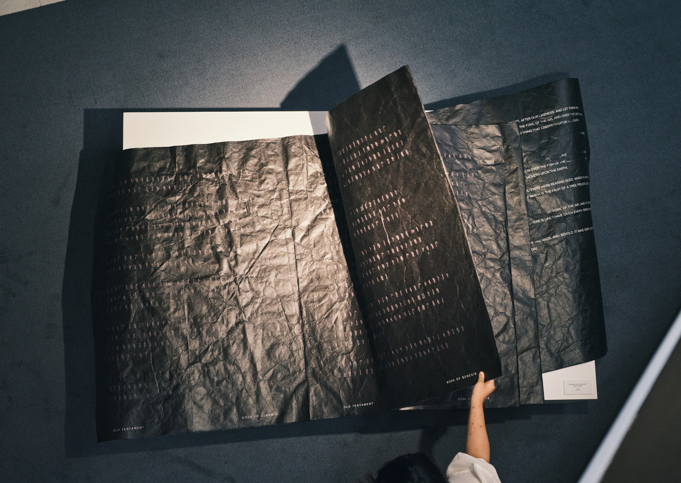
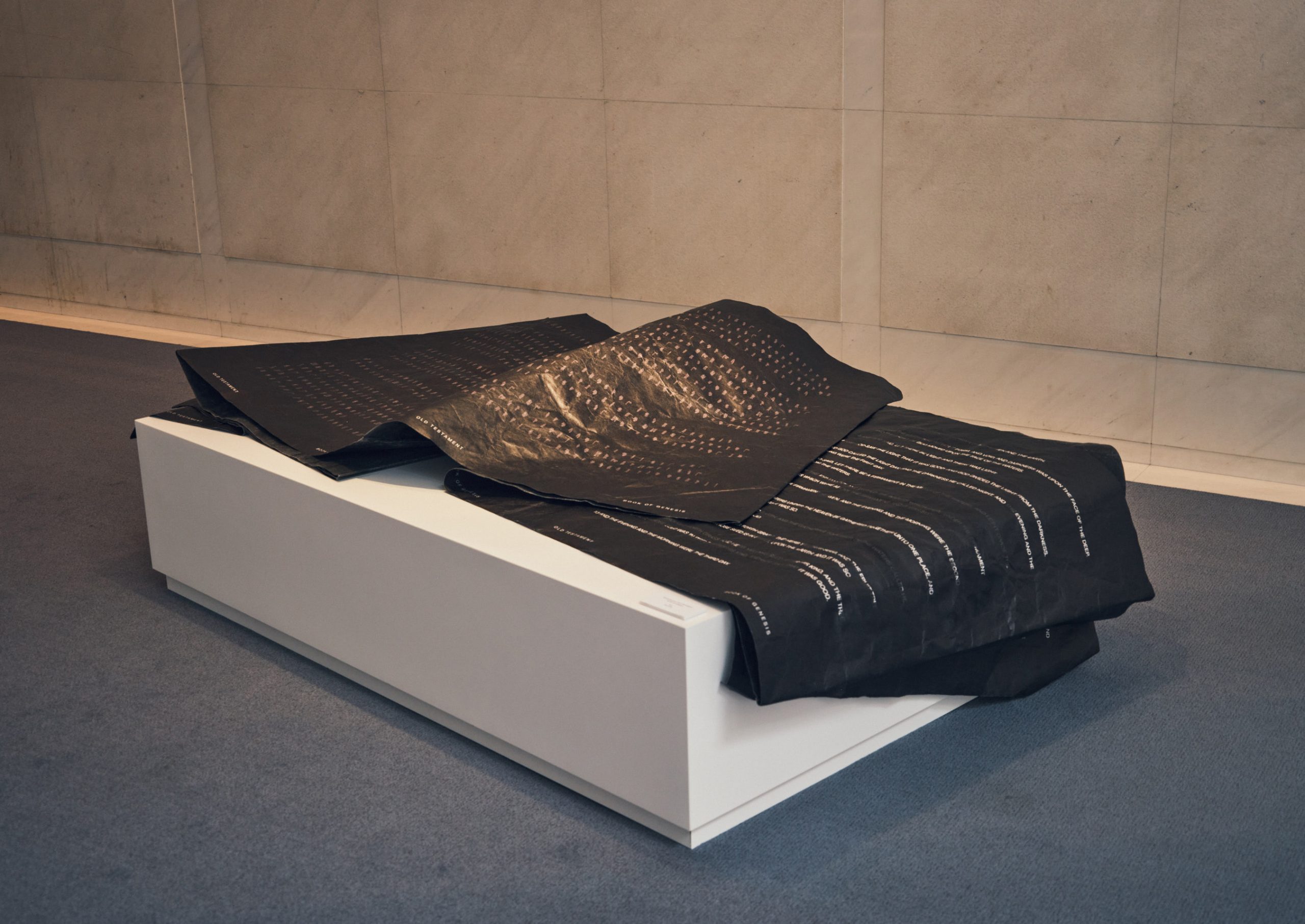
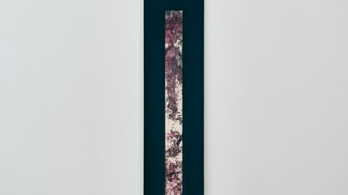
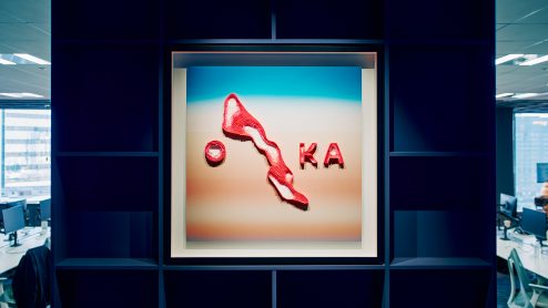
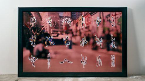
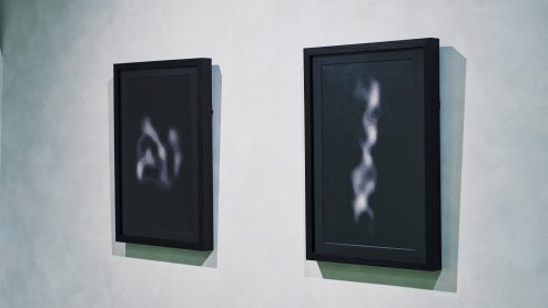
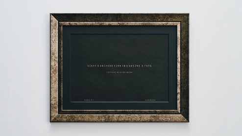
未使用的故事 “OLD TESTAMENT” BOOK OF GENESIS
2024
Mixed media
H1050mm W815mm
我作为平面设计师开始了我的职业生涯,并受到了瑞士风格排版的重大影响。因此,我一直在思考如何使字体本身成为当代艺术作品,而不是将其作为当代艺术作品的一部分。
Nicolas Jenson、Claude Garamond、Giambattista Bodoni、Jan Tschichold、Max Miedinger、Eduard Hoffmann的字体设计都是人类创造力的最高成果,每一种都基于特定的审美感和设计理念。然而,只有字体设计师才能与这些想法互动,大多数人并不知道每种字体背后都有一个清晰的理念。
此外,人类的交流是声音、手势和面部表情的结合,但字母只记录声音。然而,大部分人类历史都是通过字母记录的。在成为书面语言之前,肯定有大量的信息丢失了。
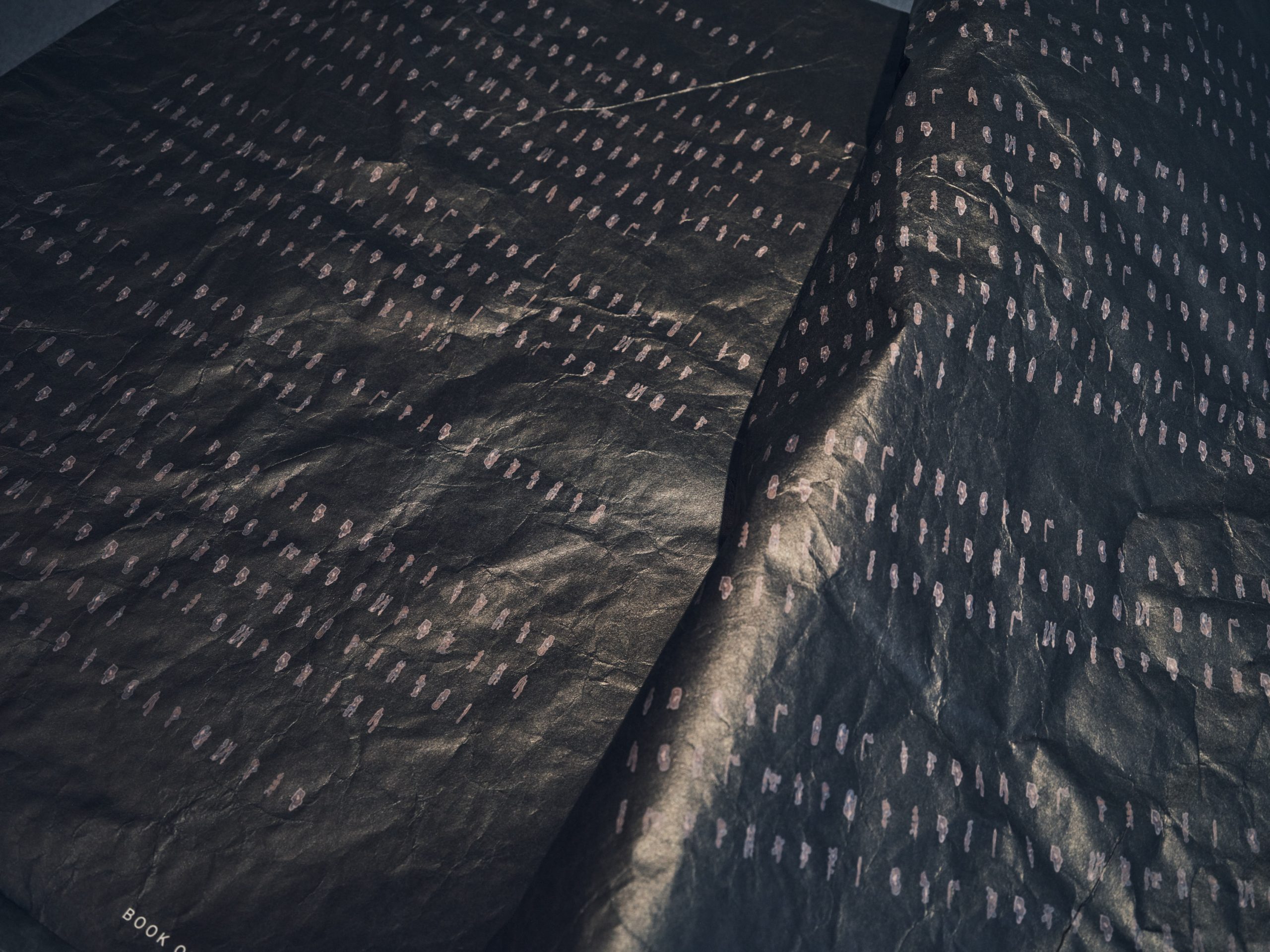
幸运的是,今天有许多字体编辑器可以让我们创建自己的字体。我们还有复杂的数字录音机、声波图软件和图像编辑软件。我决定使用这些工具创建一个字体集,从围绕着清晰可听的单词的声音中提取出声音,但这些声音已经从单词中消失。这是一个隐喻,说明书面记录的声音周围总是存在着未记录的声音。与此同时,字体集本身也有可能成为当代艺术作品。
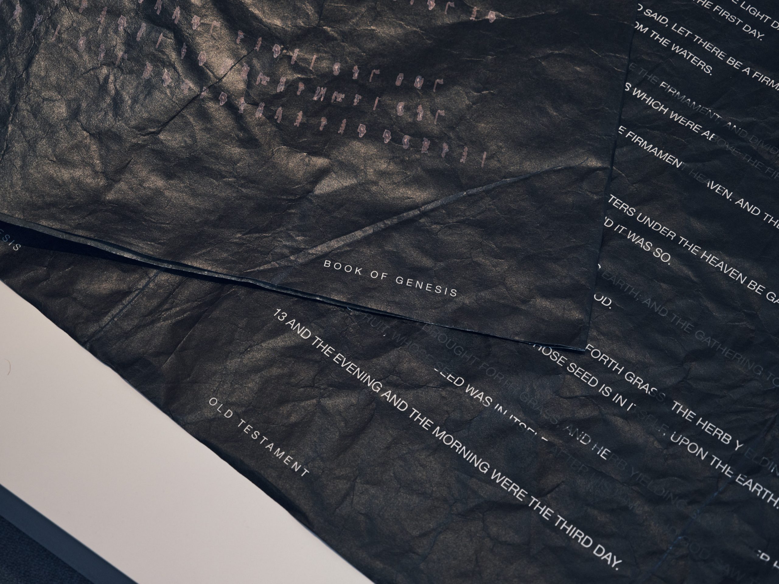
这是一个关于溢出历史上所用文字的作品。屏幕上的字母是从大声朗读字母的声波图中提取出的数字,正好在字母发音之前和之后。与声音相对应的形状类似于字母,被提取并输入字体编辑器以创建一个字体集。这个字体集没有字距,所有的字母都有方形的边缘。这项工作使用这个字体集来书写《旧约》《创世记》的开头。
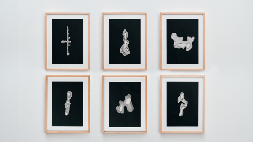
习作
painting
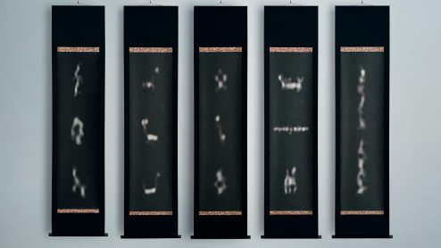
声音中的声音 “2011年3月11日福岛第一核事故”
digital print
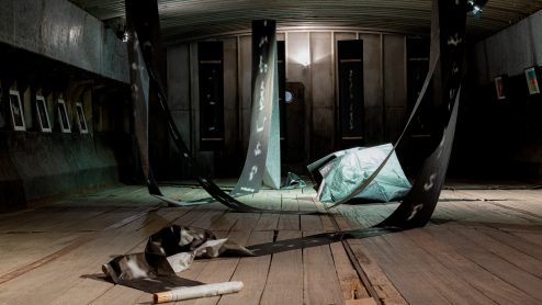
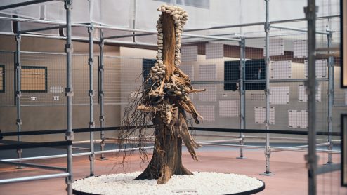
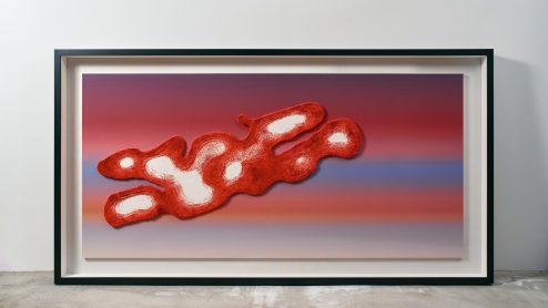
八百万的痕迹
digital print
八百万痕迹的雕塑
sculpture
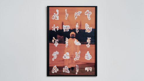
溢出的标本 “大阪站”,“金泽站”,“敦贺站”,“京都站”,“米子站”,“和歌山站”,“三宫站”,“冈山站”,“广岛站”,“博多站”
commission work
我们都是 “Wesmo”!
commission work
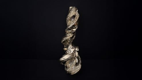
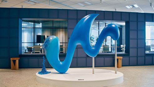
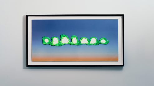
多样性的花束
sculpture
声音中的声音“ People shouting from their windows during the lockdown in Shanghai / From Patrick Madrid’s post on X”
digital print
声音中的声音 “Sandra Oh speaks at anti-Asian hate rally in Oakland / The Pitt News”
digital print
八百万的痕迹
digital print
八百万的痕迹
digital print
溢出的标本
photo painting
八百万的痕迹
commission work
溢出的标本
commission work
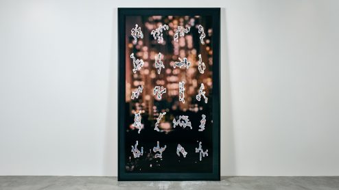
未使用的故事 “בְּרֵאשִׁ֖ית בָּרָ֣א אֱלהִֹ֑ים אֵ֥ת הַשָּׁמַ֖יםִ ואְֵ֥ת הָאָֽרֶץ” WYC1382 -In The Bigynnyng God Made Of Nouyt Heuene And Erthe.-
digital print
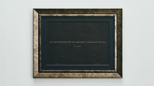
未使用的故事 “Epic of Gilgamesh” SUMERIAN -ALL THAT THEY DO IS BUT WIND-
digital print
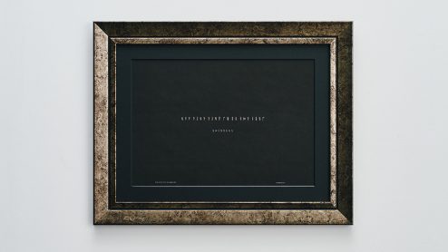
未被使用的故事 “Sonnets 18” William Shakespeare -Shall I compare thee to a summer’s day?-
digital print
城市子宫
commission work
致您的信件
接收即将举办的展览和艺术作品的新闻。
请订阅我们的最新资讯信件。