Seitaro Yamazaki Newsletter September 12, 2024
I am now breathing a sigh of relief after six months of preparing for my solo exhibition at the Aoyama Spiral Garden. I would like to thank once again everyone at Spiral for making the exhibition possible, JR West and other sponsors, Seitaro Design Group for their cooperation, and all the people who came to see the exhibition.
Upcoming are overseas exhibition. Warsaw Gallery Weekend at the end of this month, a solo exhibition in Siroki Brijeg (Bosnia and Herzegovina) and a group exhibition at the DeLand Museum in Florida in October, and another solo exhibition in Berlin in November. Next March, there will be a group exhibition in Korea and a solo exhibition in China.
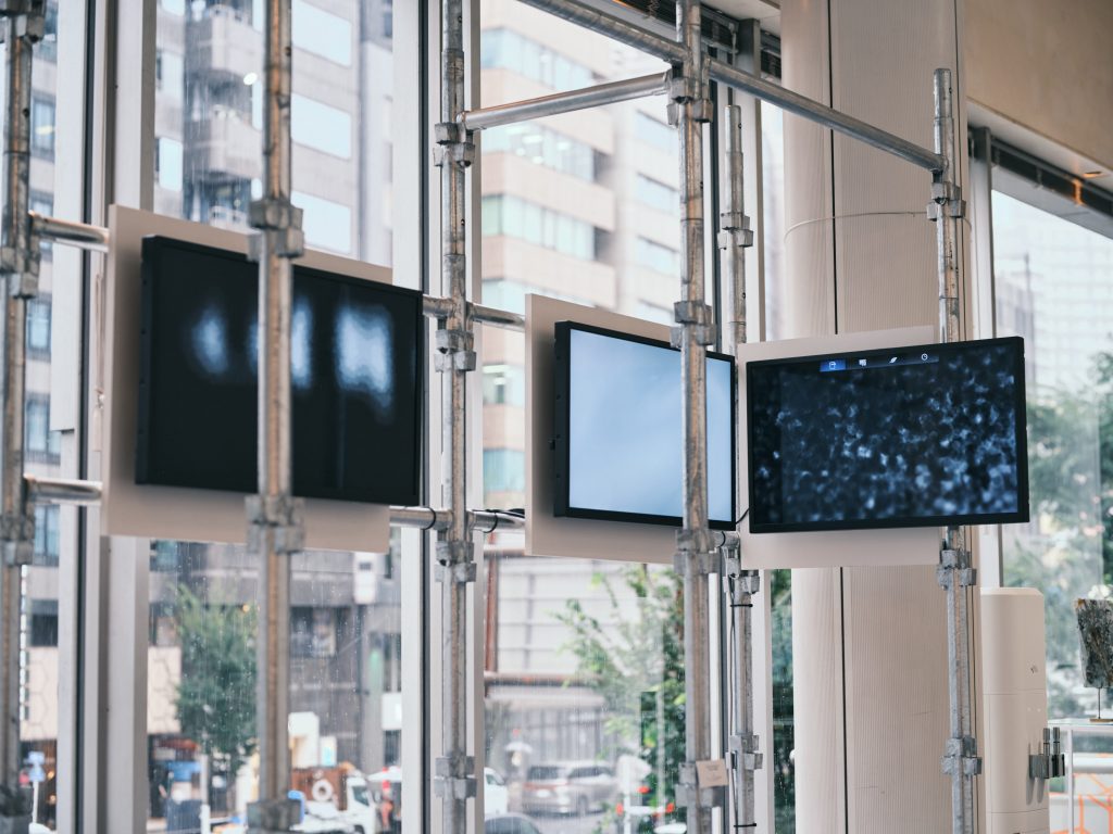
Today, I would like to briefly introduce each of the works exhibited at Spiral Garden for those who didn’t get a chance to see the show. The works may have been difficult to grasp because it crossed the boundaries between design and art.
This is a collaborative work with “P,z,” a project of JMC Corporation, of which I am a Director and Chief Design Officer.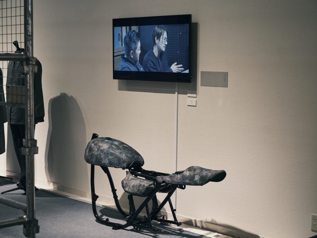
P,z is a project to make old car parts using latest modern technology. The underlying idea is to make old cars a reliable tool of choice for everyday use, rather than just showing off a decorated classic car.
Applying the same techniques for “Fossil from the Future”, I created the Kawasaki Z1 but without the acrylic brand logo. If you compare with the “Fossil from the Future”, you will see what is the same and what is different.
In 2018, I was invited to participate in a project called acoya, in which Japanese and Dutch artists were invited to create works on the theme of pearl farming in Omura Bay. This is part of the installation I created at that time.
When pearls are removed from the mother shell, they have a distorted and unique shape. The pearls are then polished, bleached, and shipped as jewelry as if they were uniform industrial products. I created this work hoping that the pearls, each of which has a different shape, will give the viewer a sense of the unique time that each pearl oyster should spend in the sea.
This work was also used in a commercial for a semiconductor manufacturer that was aired in the Kyushu area.
This is a new series of works prepared for this show.
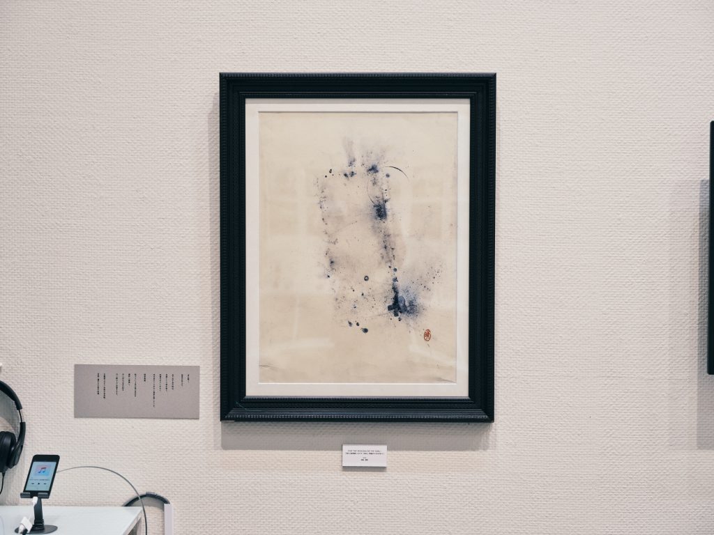
Japanese ink wash painting and Swiss-style typography have had a great influence on my visual expression. In this series, I tried to superimpose two traditions, the East and the West.
In Asian ink wash painting, it is common practice to write characters on images. In China, it is called “batsu,” and in Japan, it is called “gasan”. The beauty of the characters themselves and the beauty of the combination of characters and pictures are both pursued. Western typography, too, seeks the balance of beauty when combined with text.
In this work, typography can be seen as a gasan added to my ink wash painting, or conversely, the ink wash painting can be seen as a background for the typography. This is another attempt to redefine letters as visual expression.
This series was introduced in the last newsletter and was the main exhibit of the show.
This is a work in which the font set itself is used as media art. I vocalized the Latin alphabet from A to Z in order, and extracted shapes similar to the letters from the sonographs of the voices corresponding to each letter, and created them into a font. Since the font is not readable, I’ve written out a few well-known phrases from Shakespeare’s Sonnet 18 “Shall I compare thee to a summer’s day?”, the Epic of Gilgamesh, and “Genesis 1:1” from Wycliffe’s translation of the Bible. In this series, I hope to depict another world line in the history of printing and fonts themselves.
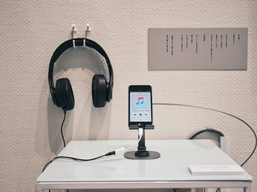
In order to redefine the physicality of the act of reading text, we also exhibited a Big Book. There was also a corner where visitors could freely type in words and letters in the font and print them out.
This is another relatively prominent exhibit.
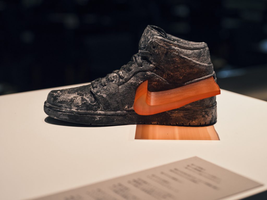
Fossils from the Future is a series of works created in 2022. Globally popular products of various brands are 3D printed with sand, and finished with baking and coloring. Just the brand logos are made of acrylic, and they pop out from the product itself. The body made of sand will be consumed over time and destruct but only the brand logo will remain the same and continue to shine.
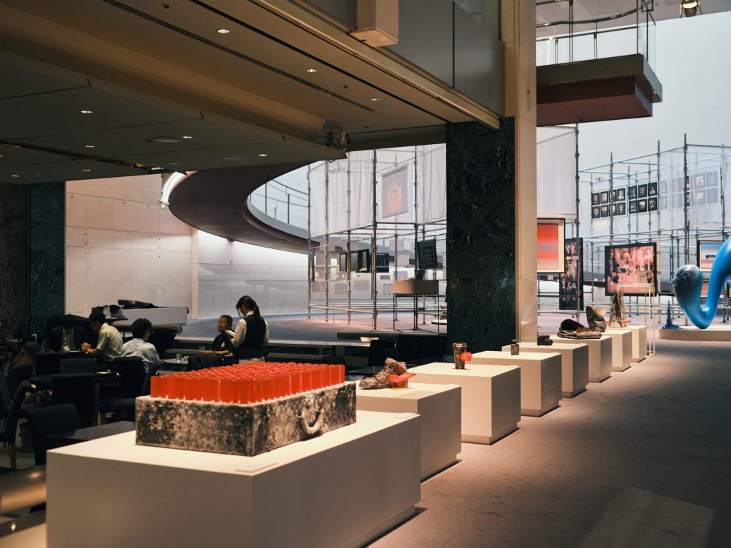
The Nike Air Jordan 1 is one of my masterpieces, and has been exhibited many times in Italy and the United States. It will also be exhibited at the DeLand Museum starting this October.
This was the first piece I created when I started contemporary art, and also my first overseas exhibition in Amsterdam. It is an installation inspired by Junichiro Tanizaki’s “In Praise of Shadows”. This novel is like a bible in the design industry.
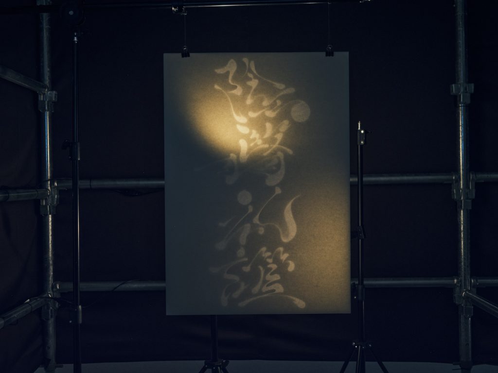
In this work, I designed the four characters “陰翳礼讃“ as if the proportions of the characters were melted down, with the intention of capturing the moment just before the characters become letters. The letters are cut out and clipped with paper, and light is dropped from the back of the paper to express the ambiguous existence of the letters. The installation was presented with incense and ambient music mixed with sho and suikinkutsu. The common elements in my expression, such as an obsession with ambiguity, an attempt to redefine letters, and a Japanese sense of beauty, seem to have been consistent since that time.
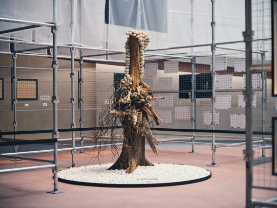
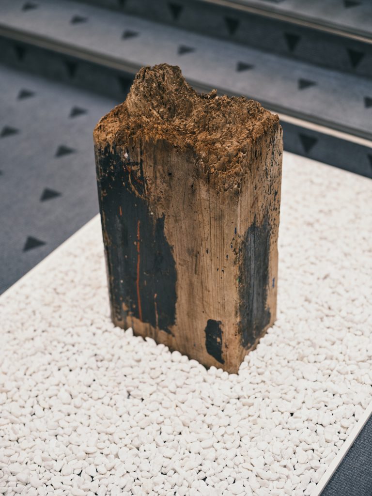
I’ve done large scale installations in the past such as “Nameless Portrait” (2018, Nagasaki Dutch Village), “In Praise of Shadows” (2018, Amsterdam), “Tayutai” (2019, Naha Airport International Terminal), “Womb of the City” (2021, The Park Habio Shibuya Cross) However, this is the first time to create a three-dimensional work that can be exhibited outdoors. I combined old wood and stones to a steel frame, and placed cobble gravel around it. The motif of this work is the tea room of Wabicha (tea ceremony).

Iron, wood, and stone have completely different material characteristics, and these natural materials contain time. As time passes, iron rusts, wood rots, and stones wear out. The speed of change is also different for each material. I created this work with the hope that I could love the moment as a bouquet of flowers, a point of intersection where “different things” become one with a sense of discomfort.
I hope to create a series of works on the theme of different places in the future.
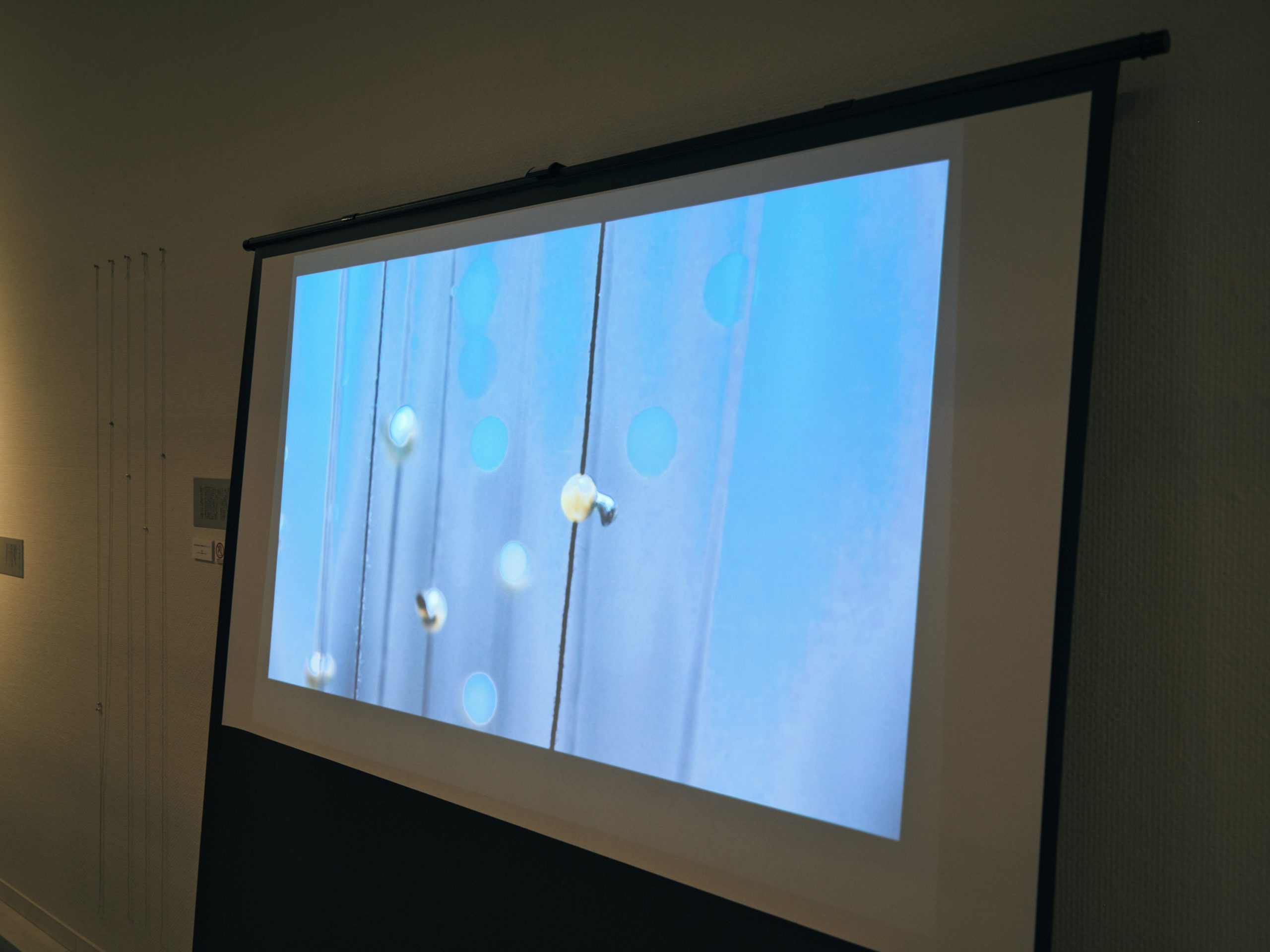
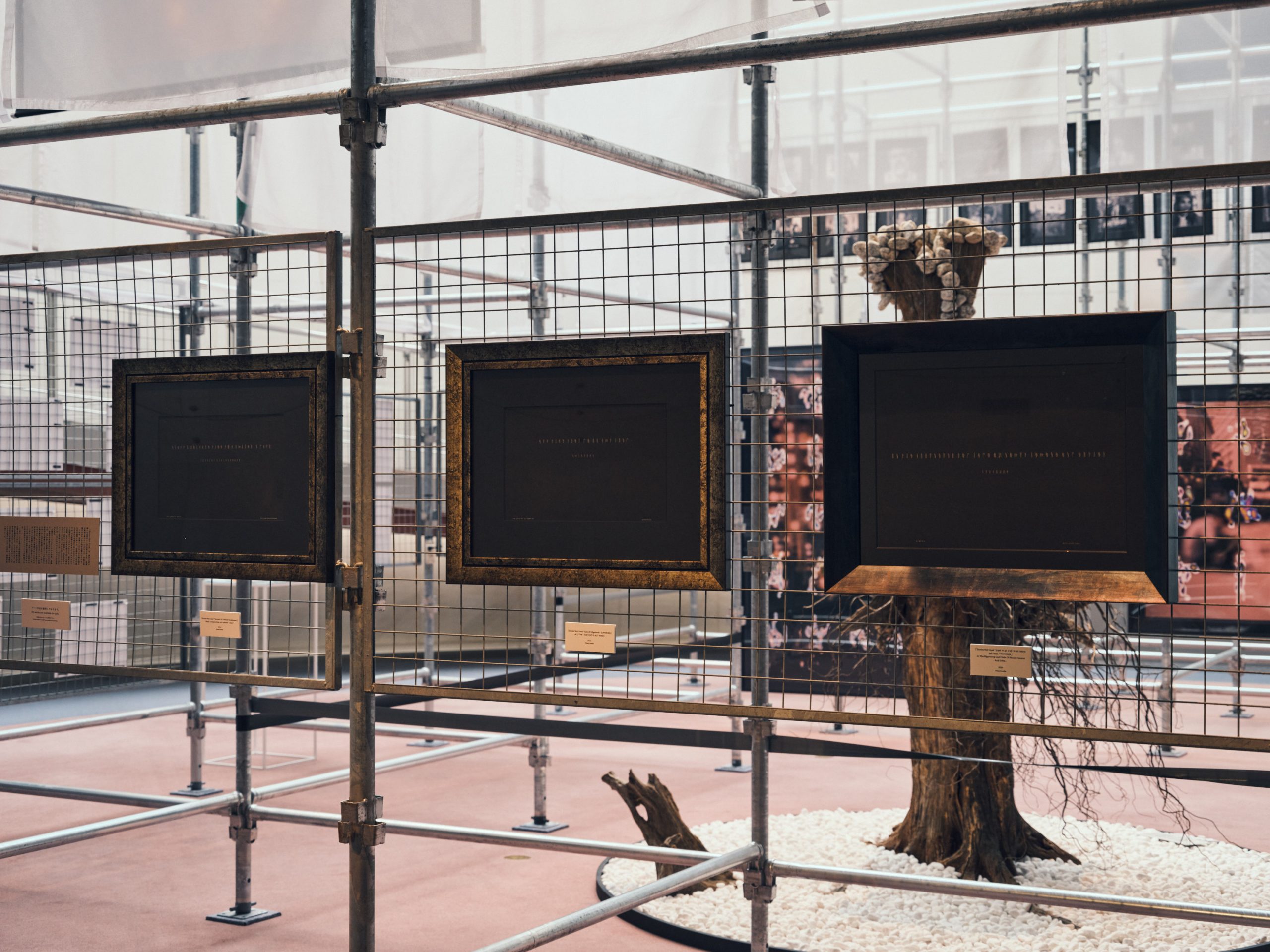
This is the first series that directly refers to current news events. Using a sonograph, I transformed the sound of various news videos from around the world into figures, and took the figures drifting on the border between human voices and background noise, and placed them on top of blurred screenshot of the video.
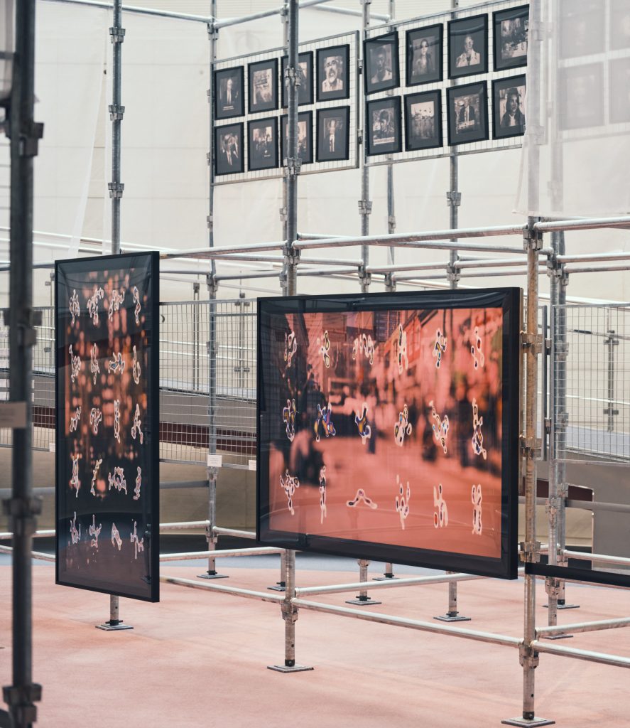
This experiment is intended to tell that there are facts and feelings that could not be conveyed in words, was intentionally not put in to words and was difficult to be shared as words. Two works from this series will be exhibited in a group show in Warsaw at the end of this month.
This is a graphic notation for the project “NU/NC” with guitarist Yoshito Tanaka. Graphic notation is a type of musical notation that expresses music in various shapes, rather than in a written score with clear rules such as staves, which became popular in the 1950s under the influence of abstract paintings in contemporary art. Most of them are drawn with clear lines and colors, but I created ambiguous screens by connecting the particles of sound with those of painting. You can still listen to it today on Spotify and other streaming apps.
This installation was commissioned by Mitsubishi Estate Residence in 2023. I created a tranquil space in the middle of the urban space of Shibuya, a symbol of silence, and played sounds similar to those of the womb. Using primitive materials such as old wood and metal plates, the work attempts to create a static space for self-reflection in the midst of a dynamic city. At Spiral, a portion of the old wood used for the installation was exhibited.
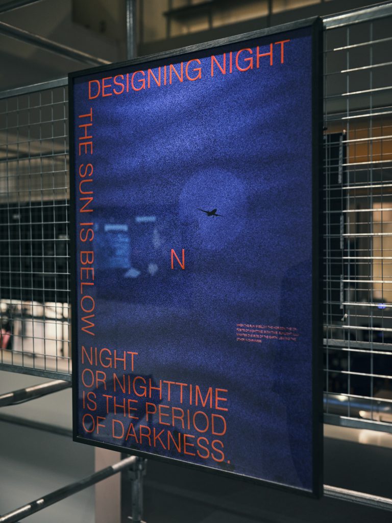
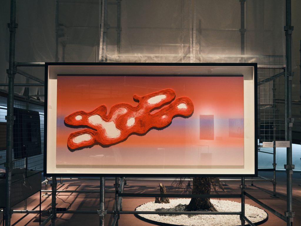
This is a series I began creating in 2023. My starting point was to see if I could make visual art of “signs” and “earth spirits” of various lands. In this exhibition, I have sonographed the sound of a video I shot while walking around Shibuya station at night. I then enlarged the ambiguous shapes and printed them as if they were photographs.
Since ancient times, there has been a religious belief in the Japanese archipelago that spirits dwell in all manner of things. I believe this is related to the culture of turning things in to characters, like Pokémon. In Japan, these spirits are collectively called the “eight million gods”. Famous gods with names are often depicted in human form, but I wanted to express the traces of spirits that do not have a name.
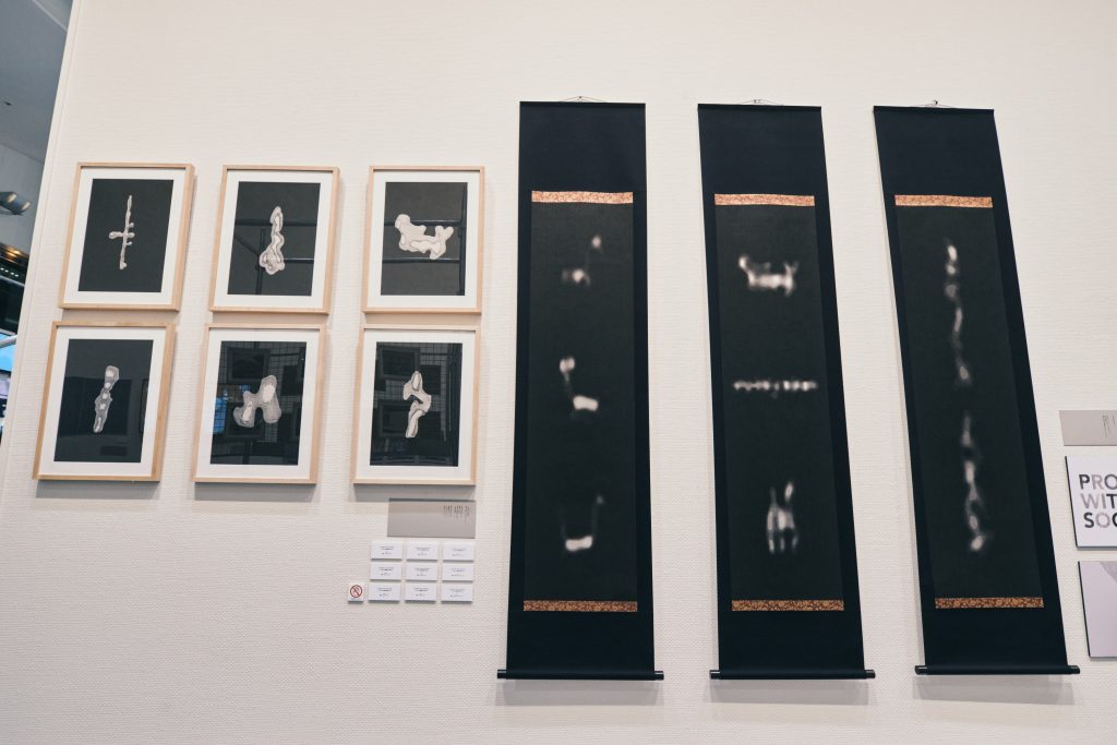
There are two types of “Traces of Millions”: a framed and a Kakejiku version. The framed version has a higher contrast, making the “traces” look a little more three-dimensional and clearer, while the Kakejiku version has the same vague “traces” that I picked up from the sonograph.
This is the first work in which I used the sonograph, which has become the foundation of my current work. It is an endless projection of sonographs of sounds that are hard to distinguish from either noise or music, drifting around the sounds of Steve Reich’s famous piece “Counterpoint”.
The score (including the graphic notation) describes how to produce the musical sounds, but the work is about what the sounds would sound like if they were extracted from the margins of the score.
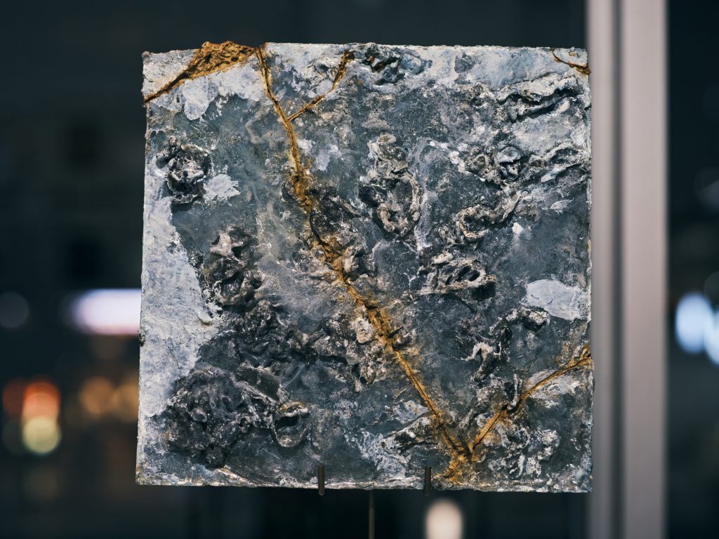
I created this work in 2021. At the time, I thought it was interesting to see the phenomenon of broken porcelain taking on a different value after being kintsugi (gold-plated), so I actually created this work to investigate what would appear if a lump of resin that had no value before being kintsugi (gold-plated) were kintsugi.
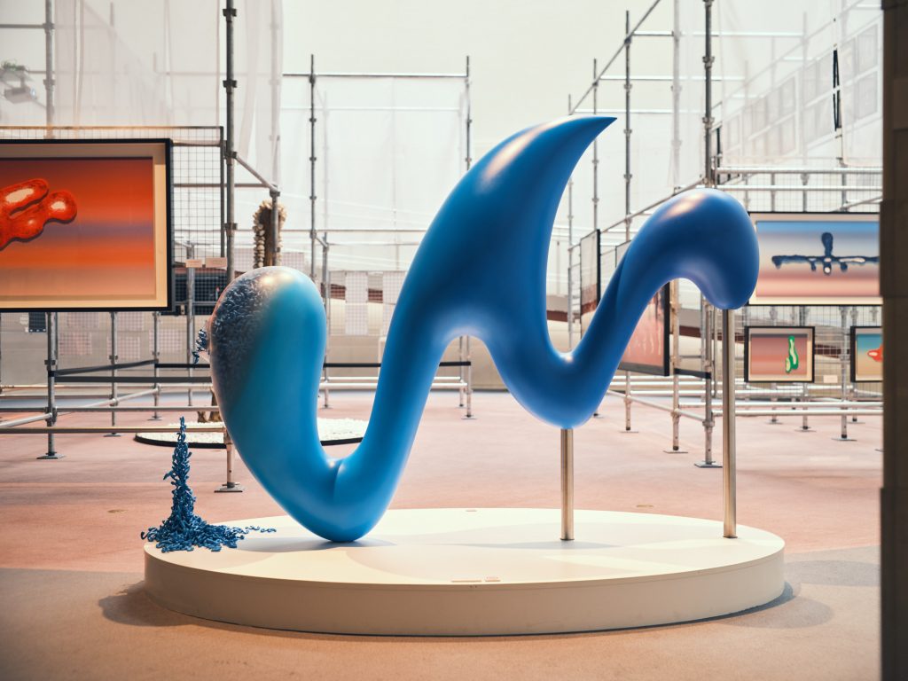
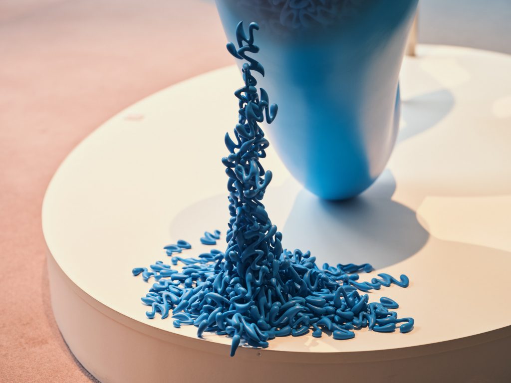
This is a sculpture of what I designed as the logo for “Wesmo,” a mobile payment system for JR West. I constructed it in which aluminum casting and FRP are smoothly connected in such a way that it is not recognizable. Mini Wesmo-kun (tentative name) springs out from one end and is intended to present the small individuals. I imagine a scene in which all people are connected to create the future.
LETTER FOR YOU
To receive news on upcoming exhibitions and artworks.
Please subscribe to our newsletter.